Make A File Do More

If you’ve been in any field long enough (craft, wedding, art, photography, name the occupation), you realize that you can collect files and ideas for eternity and use it once. Or… you can find a way to make one file work for you in countless ways.

For example, photographers take the time to develop their basic settings for editing a photo. With this setting saved, they take a photo, hit the saved button, the adjustments from the saved settings are automatically added, and then they make a few minor adjustments before going to the next photo. So instead of spending 15-30 minutes on one photo, they can have one done in a couple minutes.

Photo by Lukas on Pexels.com

The same can be done with cut files.

The perfect part of working the same basic cut file over and over again is that you create more value for yourself, save time (instead of always starting off from scratch), and you have a primed canvas ready to go for your next idea. Sometimes you have that perfect text or saying that you want to use, but don’t have the inspiration to make something unique to go with it. Think of it like your basics white T-shirt and jeans combo. It’s always ready to go and you just throw on something on top to make it just right for the moment.

If you set up shop at a craft fair, this is especially important for you. How many times have you heard someone comment that they like something, but it doesn’t quite fit them (whether style, color, whatever). By having one item a couple different ways, you decrease the chances of a whole lot of product going home with you AND find out how to optimize your sales by what style sells better. Plus, when it looks like someone is getting a one of a kind (instead of a cookie cutter) item, it’s most likely to cause a sale. It’s the thrill of buying what someone else can’t have.

Cohesion and simplicity work when you have one key element and you work it over and over again. That element is incorporated in everything. But it’s also slightly changed up.

For the next couple of weeks, I’m going to work a simple heart cut file over a few different mediums to show you what I mean by working the same file over again, for cohesion and still find a way to add diversity.

This week I’m going to use paper and vinyl with this Heart Card file.

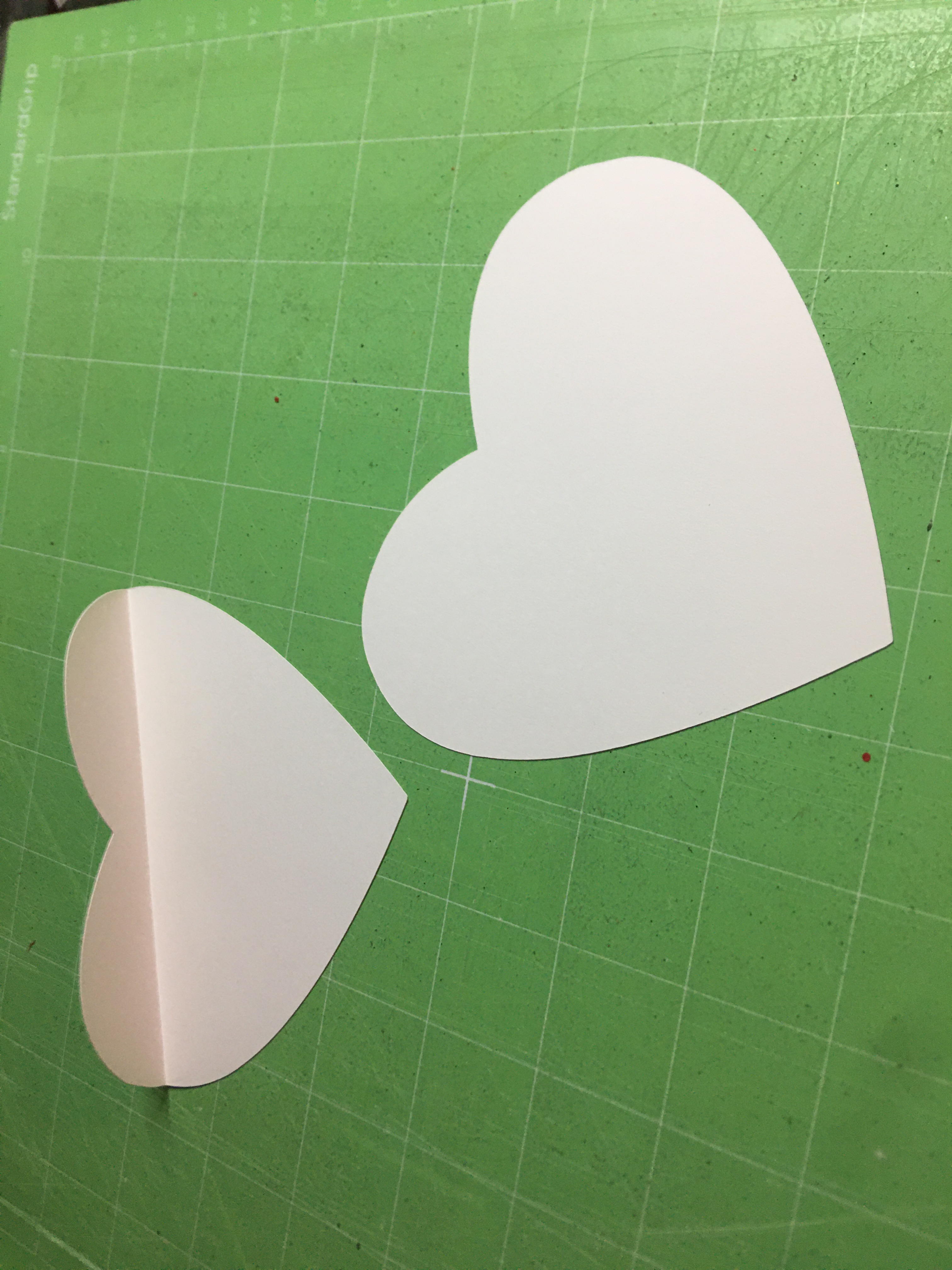
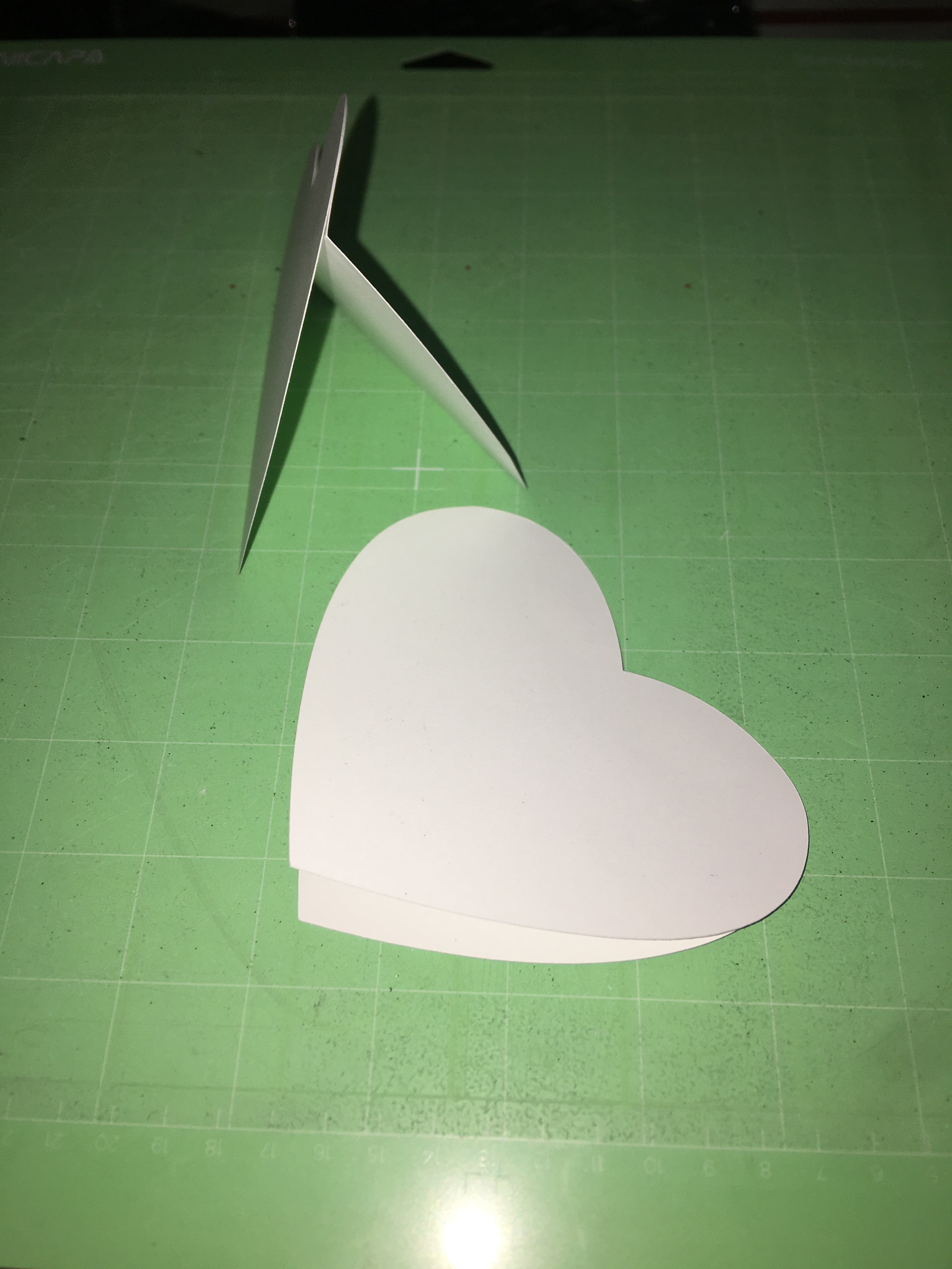
The craft here is a card. But it has two different ways of decorating built in.

Each year, for Valentine’s Day, I write on hearts what I love about my boys. And I use the hearts as part of our house decorations. As you can see in picture 3, this card is perfect for standing on its side. However, my youngest is at the paper shredding stage. So instead of standing the hearts up all over the house and letting the boys scavenger hunting for their hearts, I will hang some decorative baker’s twine and hang the hearts like bunting/garland.

First things first, decorating. In the past I’ve done solid hearts and lace/doily hearts. I haven’t done a stain glass window style. And the leader, of one of the crafting groups I belong to) posted her heart idea using scrap vinyl. I loved her idea, because I have three small scraps boxes that I keep adding to. (I save scraps to minimize what I throw out.)

One of my scrap boxes

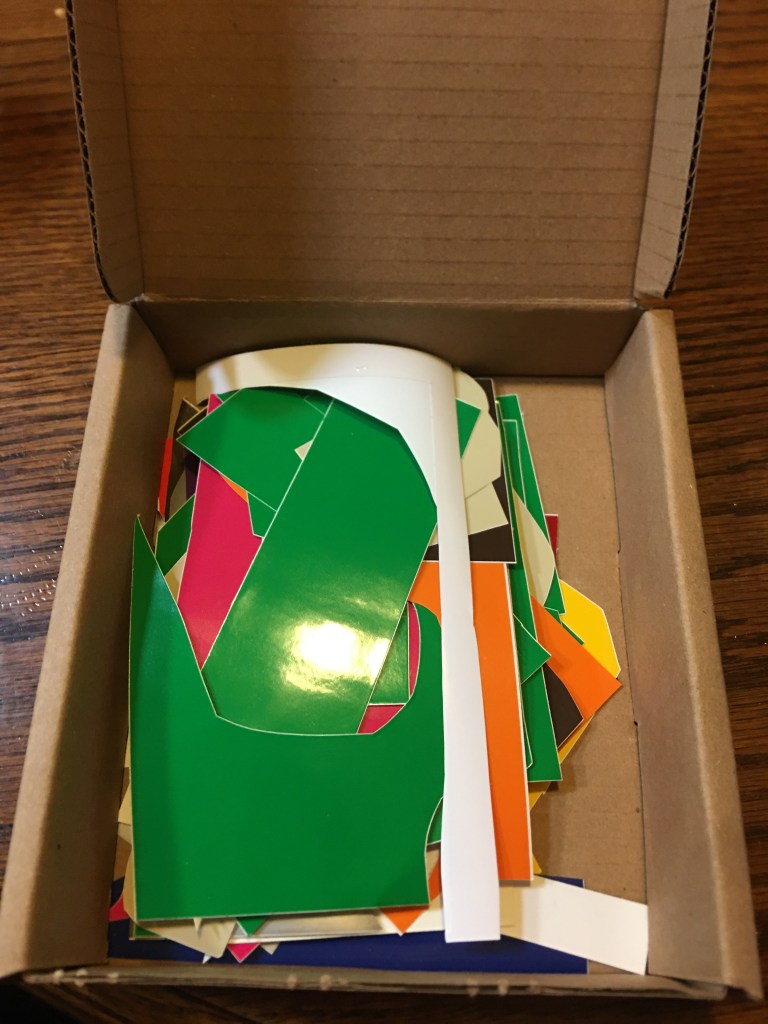
These scraps I cut into glass shard like pieces, triangles, squares… really I just grabbed my scissors and mindlessly cut away. The odd angled bits were probably my favorite ones for this project.

This was the set up for one of my sons’ class valentines. He’s a crafter and went to town, happily making his valentines.

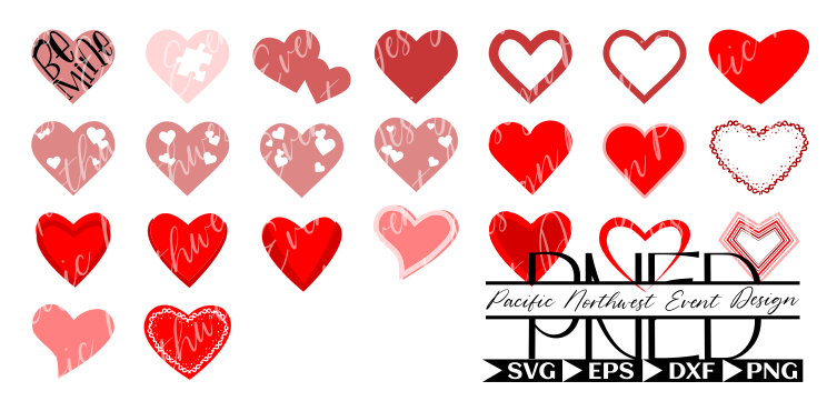
There were a lot of the red heart components (from my Hearts collection) that were left over from prepping for my son to make his class valentines. And I was particularly in love with the thin spiral looking heart. So I couldn’t let those go to waste.

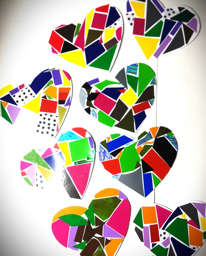
And with a little glue, the finishing touches go on quick and easy. I ran out of With a little glue, the finishing touches go on quick and easy. I ran out of glue stick and used some Elmer’s spray adhesive. Both glues worked great and I had no issue with the card stock sticking to the top of the vinyl (which was a combination of shiny, glitter, metallic and holographic).

After completing my 12 cards here (in addition to the 11 I prepped for my son), there is one bit of advice I want to give with the small pieces of vinyl. It sucks pulling the backing off of all those tiny pieces. If you puncture the vinyl, it really doesn’t show when you press it down and use a scraper to burnish the vinyl down. So you don’t have to worry too much about that. It was easier to take one larger piece of scrap, remove the backing, and cut as you go. However that has its own drawbacks. You don’t have the freedom to lay the piece down to see if it fits in a space. Nor can you adjust it if you don’t like the color combination of a neighboring piece. It is quicker, but you lose out on the control of how everything fits and looks. I wasn’t so much concerned about that in this project, because the red card stock on top framed or covered up areas that I was less than impressed with.

If my 80’s Retro hearts are not quite your vibe, please don’t dismiss this heart or technique. There are so many options out there. If you only use one or two colors of vinyl, you will have a completely different look than what you see in these pictures. If you’re not feeling the vinyl, you could do something If my 80’s Retro Funk hearts are not quite your vibe, please don’t dismiss this heart or technique. There are so many options out there. If you only use one or two colors of vinyl, you will have a completely different look than what you see in these pictures. If you’re not feeling the vinyl, you could do something different. Use Solid or Printed card stock. Paper Mache pages from a novel or sheet music onto cardstock. Or even use photographs for the non-scored heart. Glue on lace or doily on top of drawings, painting, or photos. There are so many ways of making this Heart Card work for cards or decorations for a wedding or other event!

Thanks for joining me today! Be sure to come back next week for the next installment for creating cohesion for an event with one file.


Files Used This Week

Click the links for Heart Card and Hearts to see product descriptions and get these files for your projects.

Processing…
Success! You're on the list.

Modify to Personalize

It never fails! There is a picture of a loved one that you want to use (whether for a gift, a wedding, various other reasons), BUT the background just ruins the picture. Do not fear! This post is for you.

Standard phone picture

My son has seen me make a few shadow boxes for gifts and what he wanted to gift more than anything else was a shadow box of him and his BFF for her upcoming birthday. The best, and most recent, picture that I have of them is of course the one that had a pile of yard waste behind them. Fortunately, I have a trick or two up my sleeve.

Background removed and a new back ground added

There are a few good free online programs that you can use to remove your background. For this particular project, I used Remove BG, because they’ve always offered a good selection of different backgrounds with three different blur settings. If my count is correct, there are 93 as of the time of writing this post. And the best part is that you do not have to be computer suave to change your back ground. All you have to do is upload the picture and hit “remove background”. You will have the focal point of the photo on a checkered background. You can then superimpose this image on any photo you have or you can hit “Edit” to add a background from this program.

Once I downloaded the picture, with new background, there was one additional step I needed to take before submitting my picture online to print and pick up at my local photo department. From the photo editor that came standard on my computer, I resized my picture to a larger file size. (I had gotten the error message, online, saying that I had low resolution.) With this larger file size, I was able to submit my photo. And it printed exactly as you see above. We’re not talking professional quality, but perfect for this project.

While we waited for the 5 x 7 print for my 6 x 6 shadow box, I designed a layered cloud shadow box mat to make the print fit seamlessly in the shadow box. BFF Shadow Box can be found here. My son added glitter to the second layer and chose the font, text, and vinyl choice. My about to be six year old was so disappointed that he couldn’t do the shadow box from start to finish, but he has no idea just how much he did create in the design. So in honor of the work he did, all proceeds from the sale of this cut file will go to my partner orphanage in Rwanda for the education of the students there.

For assembling the shadow box, I started by attaching the 36″ fairy lights, with hot glue, to the back panel of the shadow box.

Many shadow boxes have a finish where you can attach the lights to the inside side and top/bottom panels so you can have the lights shine through the layers. This particular shadow box has a wax like finish and the glue would not adhere. The back panel was brown and I had painted with black matte chalk paint. The hot glue loves this paint that I had no problem attaching for a back light.

With battery pack lights there are two options for how you mount the switch. This particular shadow box had a slot in the top for coin deposits. For wall mounting, or if you plan to decorate the top of the frame, this is a great option. However the kids I’ve gifted shadow boxes to have enjoyed having the ability to sit the frame on a table top so they can turn it on and off as they please. For this reason, I prefer the second option for a hidden switch. All that I had to do was take an X-Acto knife to the bottom corner of the back panel (where the battery pack was nearest glued to) and cut out a small notch. Then I hot glue the battery pack to the back panel. Make sure the screw side is out so that battery changes can be made without taking the pack off.

Once the lights are secured, I turned my attention to the shadow box layers. 1/4″ raised adhesive tape is perfect to attack the two cloud layers and photo. The depth that you see in the final product is actually from two layers of the raised tape stacked on each other.

All the prep work is finished. The vinyl text is applied to the outside of the glass. Place the cloud layers inside the shadow box. Then close the box up by placing the back panel.

This project is perfect for birthdays, weddings, showers, and celebration of life. And now that you know how to remove backgrounds, you can now use your favorite photos that you thought was unusable because of what was in the background.

If you have any questions on how to do this project, or want to know how to do some other project, please leave a comment below or email me at info@pacificnorthwesteventdesigns.com

See you next week!

Processing…
Success! You're on the list.

Don’t Throw That Out Yet!

It doesn’t matter if you’re an Artist, DIY Bride, Crafter, or a Just Because-er, you will create something and there’s just nothing you can do to save that project from the junk heap. Sometimes we get wrapped up in our own emotions of wasted time, wasted materials, dashed dreams of overextended ambitions, and everything else, that we forget even the Master Artists had unsuccessful projects.

If you’ve spent anytime in art history classes, or been around artists long enough, you probably already heard about this. All the Greats recycled their canvas. That’s right! Da Vinci, Rembrandt, Picasso, I could go on and on… they all painted over something they created before. The lesson that we can take from this is that we can create over something that we tried to create before.

This was a wood block that I had to give up on after running through Plan A to Plan F. That’s right, I tried to correct and original problem five other times! Am I stubborn? Yes. Am I determined? You better believe it. Do I succeed at everything? No. But, I give myself permission to set aside what is clearly not working. For this particular project, I discarded about 16 hours of trying to make it work and grabbed a new blank. In less than an hour, I executed my main vision without having to go through another plan letter. Sometimes scrapping a project to start over on the same vision is completely necessary. And that is when your success comes.

Here is where things get good for this block of wood. Even though I had painted it on all sides (in a color I don’t usually work with) there are ways of recovering materials and reusing it in something completely different. I had fully intended on sanding the glitter and acrylic paint off, but inspiration hit and I really didn’t want to waste the time of stripping the wood for a clean base. Instead I challenged myself with this cotton candy pink by adding black, blues and purple to the pink and creating a base that gave off a vibe of sunrise or sunset. And that in turn inspired the three variations of Darkness To Light. (Click here to see all three!)

What is amazing about blending colors and adding textures into your paint is that you can cover over even the raised text from stencil painting and the glitter. Acrylic paint doesn’t cover glitter at all. It always manages to shine through. So if you decide to not go with glitter ontop of a project you previously used glitter on, I recommend taking the time to sand the glitter off. I’m sorry I could not get a picture of the glitter coming through (I gave up after 30 attempts), but my oldest son kept playing with my lights to get the glitter to sparkle. So if you know kids, when they play with lights you know the glitter is still there. However after much finagling, I was able to get one angle where my camera did finally pick up on the raised lettering. But unless I point out stuff like, most people I know pretty much never pick up on the fact that I reused this wood block.

The raised letters are right here on the bottom just above this cloud line.

Normally at this point in a project I spray a couple of coats of clear acrylic spray over the top. It seals in the paint to it doesn’t transfer paint when you knock it against something. And I love using HTV over paint. I get a better end product with it and the vinyl stays on without lifting. (Permanent vinyl tends to lift when you have higher humidity levels.) The clear acrylic spray also smooths out your surface, making it more flat when you adhere your vinyl. Coming up the next few shots, you will see what the raised textured acrylic paint did to the vinyl. But this is something that spray acrylic and HTV really does overcome.

Instead of my usual route, I went with the unsealed acrylic paint and permanent vinyl. Going into this, I knew that there were a few obstacles that I was going to have to overcome; transfer tape stripping the paint off the wood block and the vinyl not adhering to the uneven surface.

Transfer Tape Stripping of the Paint

This is the #1 problem most crafters complain about when they work with paint and vinyl! You will find it everywhere, on every forum where people are asking for help. You will get the standard answers of use a transfer tape with less tack, use transfer paper, use press and seal…. I’m telling you that you don’t need to do any of this! The reason is that the problem isn’t the level of stickiness. The problem is that you’re pressing your transfer material onto your paint with the same force that you’re using to adhere your vinyl. Both have tack. They’re both going to stick. So please don’t spend more money chasing a solution that is still going to be part of the problem. I know because I’ve tried all the different tack and I still pulled up paint before I learned this.

Solution: DO NOT burnish your transfer tape with your vinyl.

Instead: gently lay your transfer tape in position and very lightly press it to your surface. The goal here is keep your vinyl in position while you use another tool to press down ONLY on the vinyl. With Darkness and Light being larger letters, using my fingers was enough to transfer the vinyl. For my thin letters here, I used my cutting machine’s scoring tool. This gives the ability to press down as hard as you like. You will not adhere your transfer tape to your paint. And you’re not going to scratch your unprotected paint either. Absolutely none of my paint peeled or flaked off. You can zoom in on the following pictures and see for yourself. All of my built up layers of acrylic stayed the same as they were before I applied my vinyl.

Vinyl Adhering to an Uneven Surface

There’s generally two problems under this category. One actually getting your vinyl to adhere and not lift (you’re not going to get a complete seal). The other problem is purely cosmetic, you’re not going to have that glossy (or matte) smooth finish.

For the cosmetic, unsealed raised paint is never going to give you a flat smooth vinyl esthetic.

As I stated earlier, there are ways around this. But the way that I painted and left it unsealed…this is what it looks like. If you choose to work with vinyl on an uneven surface and want to try for the perfect finish, I recommend finding an appropriate sealer to help minimize the highs and lows of your surface and then aim for placement to go where there is the least amount of height disparity. Chances are that you’ll probably still won’t get that flawless look, but you’ll get close. Just remember that the more layers of sealer you put on top you will have to allow more than enough time for it to fully dry or cure before applying the vinyl. Vinyl needs to have a dry surface to adhere to because your sealer has to breathe to dry/cure. (This is most definitely not the project you want to use the wet method of applying vinyl. Save that for a glass or plastic surface that don’t need to breathe.)

That being said, there is a solution to maximizing the potential of your vinyl adhering properly.

Once you’ve removed your transfer tape, go back through and reburnish your vinyl. Transfer tape hides alot. You never see what is not fully burnished until you remove the transfer tape. As you can see here, there was plenty of places where I didn’t press down on the vinyl enough the first time, or because the text is so thin the transfer tape pulled some of it up. In reality, for this project it was both of those things.

With nothing protecting my vinyl, I didn’t want to scratch or crease it with my scoring tool. So I flipped my tool over and used the other side. It is wider than my thin text, but it also didn’t have a plastic seam running down the middle. So I had a smooth surface to go back over my vinyl and burnish it again without fear of scratching my vinyl or my paint for that matter.

Here is the final project!

I’m sure that the question will be asked, “Did your vinyl lift?”

At the time of writing this blog, my vinyl has sat untouched for over 48 hours and looks the exact same as the finished project picture above. I have every reason to believe that I’m in the clear and the vinyl will stay as is. You are more than welcome to ask in the comments below for a future check in. I’m more than glad to fill you in on the status.

I am going to add one observation I’ve had with vinyl though. Where you put your project is totally going to effect the longevity of what you made. For example, I have bathroom art which has vinyl on top of acrylic and were sealed. the two pieces that I have in there, the vinyl on the piece nearest the shower lifted after 6 months. So much so that I had to apply some glue underneath to keep the vinyl on. The glue solved the problem and I haven’t had lifting since. The piece that is about two feet further away had one small piece lift, but not enough for me to get glue in there to reattach it. Since the same vinyl was used on both pieces, I know it wasn’t the vinyl itself. It was the humidity from being close to the shower. Vinyl does not like humity. So be aware of where your final placement is going to be. And let that information help you make decisions on which materials you are going to use for your project. Again, there are always solutions on how to fix things. But being aware is so very important for the longevity of your creations.

This was important to point out, because I will never put this Darkness to Light project in my bathroom or near my stove in my kitchen (where it would become exposed to steam). The uneven surface creates little pockets where steam/humidity can come in and loosen the adhesive bond.

Now that all is said and done, I am so happy with the outcome of this recycled project!

The scrapped project brought me so much tears and frustration. I actually hid it in my craftroom because of how many emotions is evoked in me. But it’s transformation brings me so much joy! Sometimes it’s hard for me to wrap my mind around the fact that there is ugliness and frustration under the new design. It makes me wonder if all the Great Artists felt like this when they painted over something previously made.

Thank you for walking through this transformation project with me. I hope it inspires you not to give up on something that you’ve made that just doesn’t hit the mark on any level. These projects can see new life in a new direction.

Please comment below, sharing with my any transformation projects you’ve made. Or if you’re stuck on something and would like some perspective to help get unstuck. I’m here for you.

See you next week!

Processing…
Success! You're on the list.

From Iron to Press

This past week I was following a Facebook Group dedicated to Brides who are DIYing their wedding. And my heart went out to several of these ladies. I remember DIYing my wedding and clearly remember the stress of putting together something beautiful and feeling that dreaded time crunch. It was difficult to cut that stress and maintain some proper brain function to problem solve. Sometimes it was just the lack of sleep that amplified the struggle a little more.

So Brides, if you are struggling with Heat Transfer Vinyl (HTV), this week is for you. And if you’re a crafter, new to HTV, you will enjoy some insight between tools and how they stack up with application.

There are two common problems with HTV that can be daunting if you don’t know the cause. One is movement of HTV while pressing. The other is a halo around your words or image. (You may need to zoom in on the wood sign photos to get a clearer visual on what I’m talking about.)

Your HTV Moves

There are a couple of different reasons why your HTV moves. Depending on the material you’re using, the carrier sheet might not be tacky enough to hold it in place. For example, this picture was from my first attempt to applying HTV to wood. There was just not much for the carrier sheet to grab onto. I sanded that wood down smooth and stained it. So think of it like you standing on a sheet of ice. Yes, you can stand in place on ice. But the moment there is a force that comes against you (wind, another person touching you), you’re going to move. With nothing to grip to, chances are your carrier sheet is going to shift on you once you start to press.

Solution One: position your carrier sheet and secure it in place with painter’s or masking tape. But make sure that you are not ironing or pressing over the tape, the heat will cause the adhesive to stick to your project. If you need to have your heat source on top of your tape, use teflon tape. This tape was designed to be pressed without depositing adhesive. (Tip: I always dog ear the ends of my teflon tape so I don’t have to dig and fight to pull the tape off.)

Another reason why HTV shifts is from the movement you apply before the vinyl has time to adhere to your project surface. This tends to be the most likely cause of shift for DIY Brides. Chances are you are using an iron because that is the heat tool you have on hand and saves you to money to use elsewhere.

I also used an iron for the first 4 months that I began using HTV.

Solution Two: prevent your iron from shifting your HTV by lowering and raising your iron straight down and up. I know this seem contrary to what you read from other writers who talk about how the iron does not have uniform heat. This is true. The iron doesn’t have uniform heat. Your steam chanels won’t adhere your vinyl. And if you forget to turn your steam off, it will also warp the vinyl.

The best results with an iron came when I place my iron straight on, press down with maximum pressure for about 5 seconds. Lift straight up and move to the next section. Place straight down and press with maximum pressure for 5 seconds. Repeat until you’ve given your whole vinyl this initial press. By doing this, your vinyl has a great initial contact and gives you a little more freedom to glide your iron over a single spot. When I say glide, I mean remove all your pressure and slide the iron over to your new spot with the amount of pressure of you using a finger or two to push your iron over. If you iron your vinyl like you iron your shirt, the vinyl is going to shift. But you do have to move your iron to make sure you get a smooth application.

Using an iron takes far longer than the 15-30 seconds promised on packaging and websites. That is the recommended press times for heat presses. However, if you take the extra time to minimize shifting, you will definitely get an excellent quality that no one will ever guess that you used your clothing iron to apply.

(If you find that your vinyl is not secure, so you see the grains of fabric of your material, you will need to go back through and maximize press again. Follow it up with another gentle glide and you’ll keep everything looking smooth.)

I use this same process when I apply HTV onto a wood project; maximized pressure followed with a gentle glide (even with a mini press).

Alternate Heating Sources

There are the three types of heat sources that I have used with HTV.

Not my photo. This is not an endorsement, nor am I promoter of this iron. This is a stock photo by Pixabay on Pexels.com

The iron is not my favorite but I have to admit that this is where I started. I have no regrets. And I value my experience at this stage in my HTV crafting.

From there, I moved up to the mini press. I cannot tell you how excited and happy I was for this new tool. I didn’t have the fun money to spend for anything more elaborate, but I remembered how this was a game changer for me. One shirt took me 5-7 minutes to press with an iron. The mini press brought that time down to about 3 minutes.

When I had the opportunity, I invest in my 12 x 15 inch heat press. And it quickly became my heating source of choice for everything. I use it for clothes, canvas art, small thin wood… if I know it won’t melt, I use my heat press. The only time it takes me longer than a minute to press is when I’m layering my HTV.

I know many DIY Brides don’t have the budget to get the heat press for making your decor at a quicker pace. But I did want to bring to your attention that if you are stressing over the time it is taking you to press your HTV with an iron, there are other options available. And they do come with the added bonus of eliminating the problem of your HTV shifting on you.

Halo or Ghosting Effect

If you look closely you will see the around all of the letters that there is a halo next to the gold vinyl. This is actually the HTV adhesive that has been exposed because the vinyl shrunk under the heat. Translation, my mini press could have been lowered to medium heat and I should have pressed for less time. I over compensated because this was my first time using HTV on wood. I wanted to make sure that the vinyl was going to stick forever.

Every Bride wants the details to be perfect, right down to not seeing that halo around the HTV that you applied to your decorations. The trick to not overcompensating on the heat is that HTV will tell you if you haven’t pressed long enough. So always err on the side of not long enough and add up to 5 seconds at a time of additional pressing.

HTV is good at telling you is when it’s not “done”. When you go to peel off the carrier sheet, the HTV will stick to the carrier sheet and it just will not let go. At this point you can go a little heavy on the couple extra seconds. However if it releases from the carrier sheet but isn’t fully adhered, lower the sheet and finger press the vinyl flat, then apply just a couple more seconds. When you get the sheet to release, you may find a stray wrinkle. Just smooth it down gently with your finger tips (while the vinyl is still hot), using a feathery touch. If you’re too hard, you’ll smudge your vinyl in the opposite direction. So the the lightest contact is all the pressure you need to smooth it.

HTV is such a wonderful medium to use when personalizing decorations, clothes, and other items. At first, I know it can seem daunting, especially if you start to feel that it’s giving you some attitude and you don’t have vinyl to spare. Take a deep breath. This is going to work out. Your projects are going to be amazing.

If you have any other questions or you seem to have an issue with HTV that doesn’t seem to be caused from shifting or haloing, please reach out to me. Let’s figure this out! Because if you can see in your mind what you want to do, there is a way to get that exact image.

Processing…
Success! You're on the list.

Print Confident

Use that print vinyl without cutting remorse!

Welcome to my bin of prints!

In one of my favorite online crafting groups, we were talking about if we were print or solid crafters. It was while I was reading and commenting that I drew the connection that we probably all craft with vinyl the same way we dress. Think about it! Is your closet full of prints or solid colors? Now, think about your vinyl stash. Do you primarily have solids or prints?

Me? 1 out of every 5 vinyl bins is for print.

What’s in my closet, you ask? Solids once again grossly out number my prints!

I’m not afraid of prints. I fall in love with prints. I own prints. Just like when I’m clothes shopping, I ask “What am I going to do with that?!” In fact, I only own one item with a leopard print–boots that my mom bought me because she said I needed a little fun in my life.

I love you mom!!!!

Another truth is this. All of the print vinyl I own is because of grab bag and mystery box deals that I treated myself to. I was raised on Bon sales. (Anyone old enough to know what that means just knows!) A quick summation is that you buy the deals when you see them. And when I need a quick infusion to my vinyl it is the mystery box and grab bag deals that I go. The prices are vastly better than buying like my husband is a limitless ATM. And just like a Bon sale, you know you’re buying the end of the line vinyl, the inventory that just didn’t sell, or some other reason. Even knowing that I’m going to get vinyl I wouldn’t choose for myself, I have opened boxes and said, “What am I going to do with that!?”

Sometimes we stumble across an SVG that is perfect for that print. Or there is a gift we can make that is perfect for that baby or holiday print. But sometimes we feel stuck with something that was in a surprise box, a gift given by a well intended friend or loved one, or you must have had one too many glasses of wine while you were scrolling through the eye candy we call prints… you know what I’m talking about. It looks good at the moment and it shows up at your door and your questioning your sanity.

Here is a trick that I’m going to help you move through your print shyness or buyers remorse. Because lets face it, one print that baffles us is another crafter’s unicorn. We’re going to use the technique called Masking.

(The following steps are written for those already familiar with the Inkscape program. If you want to learn how to use this program email me at info@pacificnorthwesteventdesign.com for information on how or where to get resources. If you have any questions on these steps, do not hesitate to leave the question in the comments below and I’ll help you through the hurdle.)

Step One: Take pictures of your print

Knowing the size of your vinyl is going to help you in a couple of steps when you’re ready to mask. This is going to prevent you front distorting your image and give you an acurate read on what you’re print is going to look like when you actually go to cut.

Step Two: Square off your print

I’m not going fancy with any of these images because these images are not leaving our computer. So a quick and dirty process here is going to save you time and become a reference point for you in your crafting process. The lighting just needs to give you a close enough representation of what the print looks like and near true colors. I used my phone’s camera. And in about 5 minutes I had pictures of all my prints uploaded into my computer. You don’t need to use any fancy programs. Just the photo editor that is already in your system.

When you square off you’re edges, are just making the image look like a sheet of vinyl. You’ll see here that some of the edges didn’t make it in the resizing. That’s okay. It’s not going to make a difference in the end. The goal here is to keep thr verticle and horizontal lines as even as possible, and your print as close to its original size. In fact, I even left in the blank areas from previous projects. Because this method will help you determine if the SVG size is going to fit in your vinyl remnant. Believe me, this is going to beat pulling out the ruler and resizing your image in your cutting software.

Step Three: Save your images in a file that you can locate and pull into an editing software.

Here are the additional prints that I pulled.

This SVG design is one that I wanteded to take further (I wasn’t feeling like solids were doing it enough justice), so I’m going to use a print to make it come to life. Obviously, this saying speaks to me.

https://pacificnorthwesteventdesign.com/products/dont-underestimate-my-level-of-craftiness
Click image to get this cut file

Step 4: Open an editing software and pull in your SVG and vinyl images.

I’m going to use Inkscape, although Adobe Illustrator can be used as well. (If you know another program that uses masking, please leave that in the comments below.) I like Inkscape because it’s a free program and it’s the one that I design in right now.

All of these images pulled in much larger than their original sizes. That’s why knowing your vinyl measurements are important.

Step 5: Resize your vinyl images and SVG.

I knew right away that I wanted to use the polka dots for the first text line. With that Vinyl being the limitation to the design, I adjusted the SVG width to 6 inches. And now with the SVG able to fit on my Vinyl I set about selecting which prints I wanted to use.

Between you and me, I find matching two prints intimidating, let alone 4. But when I had all the vinyl imputed and saw the SVG with the dots and three prints I put on the right, I knew immediately I was going to throw caution to the wind and go all in on print. Yes, this solids girl is going print.

Step 6: Mask your print on your text/elements

To Mask, you want to want to select your vinyl image and the text/element you want to attach the design to. If there is more than one text or element you want to use with a particular print, you will need to make copies of the print. Because once you make the mask, the vinyl image is going to disappear.

If you add the mask and you either don’t like it (color, design, etc.) or it’s not giving you the effect you want to create, you can drop the the mask by hitting Release.

You will notice that the vivid vinyl image is muted. I don’t have the exact reason why this happens. However I have the suspicion that it has to do with the pixels of the image I brought in. Since I’m only using this technique as an aid in helping to decide how I want to use print, the muted colors are only a slight inconvenience. I can see the print design and have enough color coming through to see that these prints will work with each other.

Complimenting your prints here, instead of just having your sheets next to each other, gives you a better idea of how your print is going to show up as a final product.

For example, look at “Craftiness” and the top splash layer below it. I chose to use the same purple roses print. The roses don’t come through at all in the text. However in the splash you can pick up about 4 roses. Even though that is the exact same vinyl, my project is going to show those two elements differently. I’m not a fan of this vinyl (yes, it was a what-am-I-going-to-do-with-this vinyl), but after I cut this project out, it’s probably my favorite part of the design.

Step 7: Import the original SVG into your cutting software

For right now my cutting machine uses Design Space, so that is the screen shot that you get for this shop. But no matter which software you use, you will still have the same step here. You’ll want resize your SVG to the size that you determined from your vinyl selection. Then you will ungroup the image and join the text/elements that will cut from the same vinyl. And before I go to cut, I always make sure that each vinyl has a different color

Finished project on a glavanized steel sign

Here’s my final product. And true to this SVG, this has been a full expression of craftiness. From past experience, galvanized steel looks barren if your vinyl takes up less than about 80% of your surface. And originally I had painted the steel a light grey that complimented all of the full size vinyl. However the dot and splat vinyl blended in too much with the grey. The texturized blue correction (that you see in the center) did not work either. So Take #3 included hand painting in a nature scene.

Art continues to amaze me because what started off with a stylized splatter design took on additional form by becoming hills or a low lying mountain through a forest clearing.

I want to hear from you!

What did you think of using this process? I also want to see what you’ve made and hear if it has increased your confidence in using different prints together.

Be sure to sign up for my Newsletter so you don’t miss out on future content!

Processing…
Success! You're on the list.