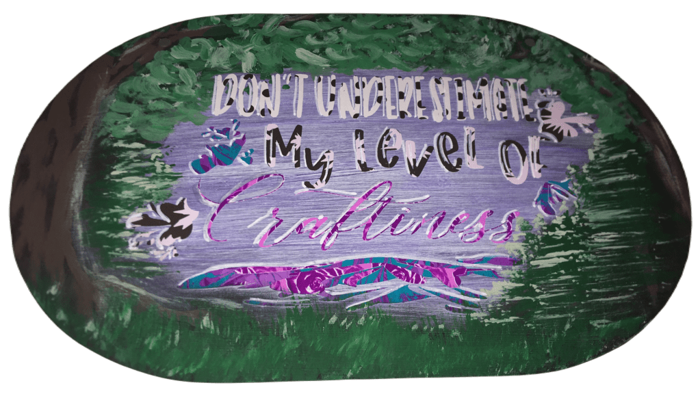
International Women’s Day & Crafting Month

Created to Make

It really is amazing to think about how much of our world and lives are all about creating something. Sometimes the first thing we think about when we hear “National Crafting Month” are the classic artistic skills of painting, quilting, sewing, crochet/knitting, needle point…everything that you would step into a crafting store to build your supply lists. Maybe you say you’re NOT a crafter because these classic forms of crafting feel as foreign and difficult as learning a language from a country on the other side of the world from you. But there is so much more to crafting.

Crafting is what we learn from others.

In my case I learned how to craft from my mom. She learned from her mom. She learned from her mom. And I’m not sure how far back that goes. So when people ask me, I’m at least a third generation crafter. I learned the old crafts. It’s what my matriarchs knew and passes on.

And while I move forward with new crafting technology and techniques, I’m also mindful of how things use to be done.

For example, the inspiration for what I’m writing today is birthed from current events, what every day women have done for centuries, and how to be creative in unifying these ideas.

For many years, my family has been taking care to learn how to grow a garden. One I have fond memories of my grandparent’s garden. My mom even off and on grew a garden.

I mention gardening because of the events unfolding in Ukraine, worldwide fertilizer production has been drastically cut back. In fact, many farmers around the world who depended on fertilizers to produce food for their local and global markets are not going to have the supply they will need. In fact, it is still uncertain if Ukrainian farmers will receive their wheat seeds in enough time for a spring planting. If they do not, many countries around the world will not have wheat to import, because Ukraine has been their wheat supplier.

Now I’m not a farmer. I don’t supply food for other families. However, I’m mindful of what is going on around the world market because I want to be aware. Knowing what I know, now, it’s becoming important to me to grow more for my family right not. Yes, inflation and the cost of groceries plays into that. It play into any first world country family who is living on a budget. And it’s ignorant of me to ignore the fact that so many other families, in areas not as prosperous as the place I call home. So to honor those families, where I may not have as much influence to change what they are facing, I’m making conscious decisions to change how I’m doing things right now. If I grow more, and use more of the resources that my two hands can produce for my family, than that frees up resources for others to provide for their families. I learned how to grow a garden as a child. Not all families around me learned that skill set. So I use my skills to provide for my family, so there’s less strain on my local market, which has a trickledown effect. If enough local families relieve the food chain, it relieves on a regional level. This in turns frees up resources on a national level. And in an ideal world, governments would not be wasteful and they would take these excess resources to relieve the food vulnerability in other countries.

And that would take me in a new conversation away from what I want to focus on today.

International Women’s Day

The one thing I love about being in the Pacific Northwest is that I grew up in an area where I learned about and ate cuisine from different places around the world. And from these different cultures I’ve learned food preparation that I would not have learned in a less culturally diverse community.

And while the most popular women to honor on International Women’s Day are politicians and celebrities, I want to draw attention and bring honor to the more humble group of women–village mamas. It doesn’t matter if a culture’s history was spent mostly in a tribal setting, rural village, or small townships, Mamas were the ones who made the world turn and kept families alive. They passed down cooking techniques and recipes that kept their people alive through countless seasons and years of famine, blight, war… they put the food on the table. And boy do mamas know how to make food resources stretch.

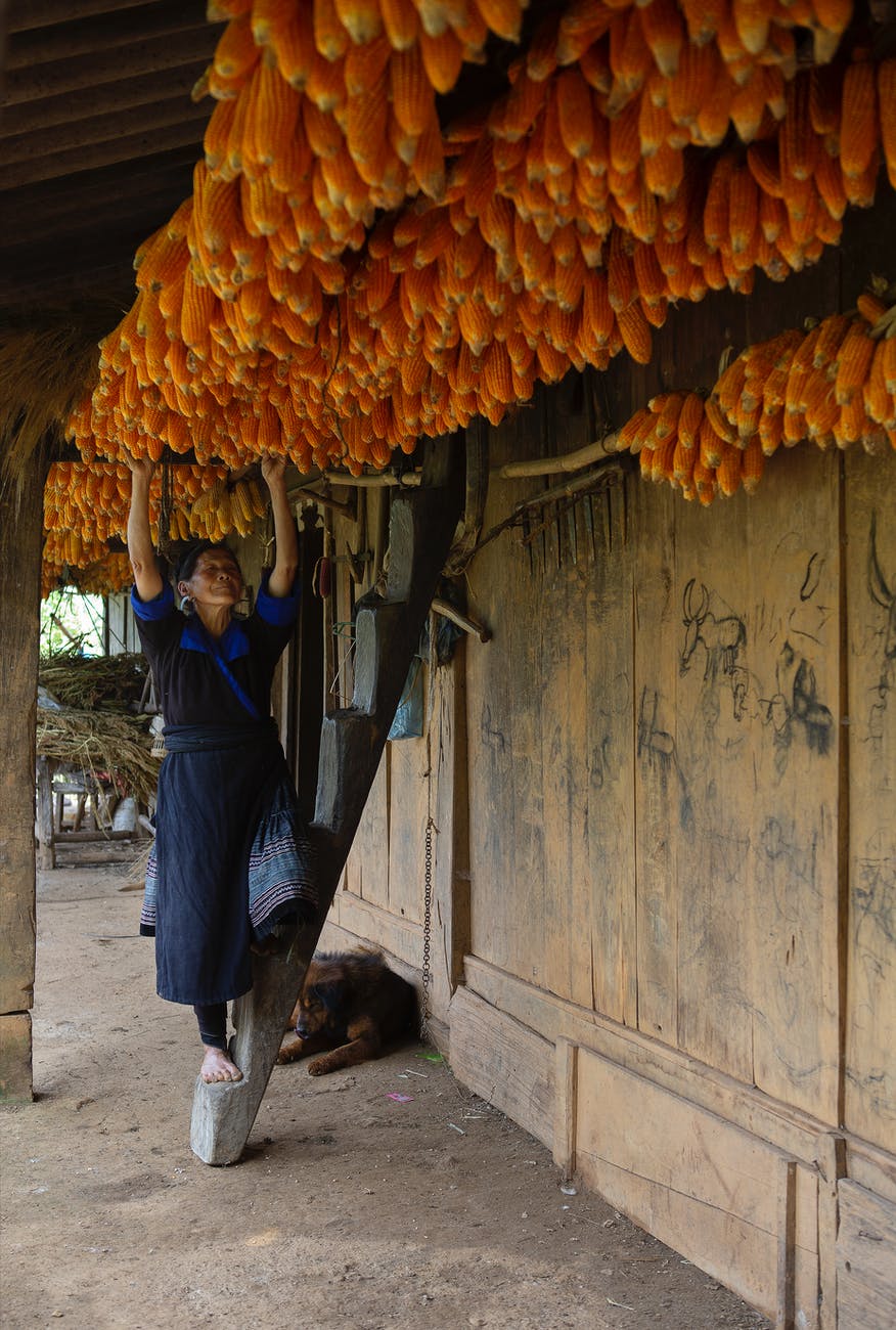
This week I’m particularly been in awe of all the women who fed their families in a variety of ways with one crop, corn.

Photo by Tran Le Tuan on Pexels.com

I’m not going to lie, I grew up where family recipes consist of cooking corn on the cob. And then you either eat it on the cob or cut it off the cob. Other than cornbread, that is what I inherited in my ancestral cook book. I will also be truthful and admit that corn is my least favorite. So yes, ladies around the world, please feel free to send me your favorite corn recipes. I will gladly embrace them, because I’m educating myself on the uses of corn to become less dependent on wheat for providing for my family. This fall, it is already on my books that I’m going to teach myself to make masa and tortilla from the corn I harvest this year. I have a general working knowledge and it will officially be put to the test.

And step one in my education, today, was shucking corn. Last fall I planted Strawberry Corn because it is a corn that can be popped and pop corn is one of my family’s favorite snacks. So I took my meager harvest that had been drying and doubling as fall and winter decorations, and I shucked.

As a historian, I’ve seen how village Latinas shucked corn by rubbing the ears together. Here is what I learned today….

There is a reason why these mamas use a basket or other larger vessel to shuck into. A soup bowl is not big enough. The kernels on the floor will be processed to germinate and put back into my garden this year. And I will have effectively doubled what I have previously planted in years past.

The easiest kernels to release are the ones at the ear tip. And those first ones take the most effort. Once I got seeds to release, I had a whole side of ear cleared in a couple of swipes. An up and down movement is what I found necessary to start the process. Once I was started a side to side movement seems to make the seeds drop much faster. Then on the last corn (with no other cob to rub against), I found that using my thumb in a downward movement (from the top of the cob), there was not much pressure that was needed to drop those last seeds.

Pacific Northwest Event Design

Another thing that any mama in a resource scarce place will tell you is that you waste nothing.

We as human beings were created to be creative people.

I harvested my corn, but here is where National Crafting Month comes in. What am I going to do with the cob and husks that are left over?

I’m not sure if there was another generation that followed my grandparents in making husk art. I honestly haven’t seen any creations at farmer’s markets for the fairgrounds since my grandparents passed away. I’m going to have to make a husk doll in the upcoming days and show you because they’re not popular hits in Google image search. I have 4 cobs left to craft with. So I’ll try my hand at that and make at least a brief posting on how that turns out. And if you’ve never heard or seen of a husk doll, then I’ll have the pleasure of passing on a little history.

But for today, I took three of my cobs and turned them into fun Easter decorations.

This is one craft that I will definitely do again in the future. In fact, I will have my boys do it. This is a messy craft, so be forewarned.

There are some bits of information that you need to know, if you’ve never had experience with corn cobs before. The husks take paint nicely with no real preparation. However, the paint feels like it takes forever to dry. I tried to keep my paint thin and it still took upward of two hours before the husks were completely dry.

Now you will absolutely love working with the cob portion!

The cob will absorb paint like a sponge. Drying will not be instantaneous but it surprised me at how quickly it was dry to the touch. I had planned on putting my glitter on wet paint, but I had to go with option 2, glue. The dry time is completely dependent on the type of glue you use and it’s dry time. The glitter does not shed easy, but some will come off on your finger if you swipe it (when dry).

Bringing it back around to celebrating women, what is something that you appreciate or want to know from women different from you?

How can you turn that into a craft to celebrate what it means to be a woman?

In fact, please comment below something that you admire about women in a culture different from your own. I’m always looking for new knowledge and skills. If you inspire a creation, I want to give you recognition as well.

Happy Belated International Women’s Day!

Processing…
Success! You're on the list.

Living Life In Color

Options For Creating Faux Stain Glass Windows

Color planning in my cutting software

With the increase of daylight, the approach of spring, and the first thoughts of Easter sprout ideas of how to bring new life and color into our lives.

This week end I’m participating in a crafting challenge. And one of the group crafts was a faux stain glass window.

When I go into these challengers, I focus on using the supplies in my office and only make a new supply purchase if I don’t have an item, or cannot think of an alternate item. Can I use a flat canvas instead of a framed canvas? Have my boys recently broken a toy that I can give a second life to? Have I recently purchased something that came in beautiful packaging that I can use to add dimension or further details?

I LOVE creating multi-medium products!

For this faux stain glass project, I didn’t have a framed piece of glass. (There are products on the market for making faux stain glass.) And I didn’t make that purchase because I have glass items I could pull from. What I chose to use was a half completed family schedule project.

I finally completed our family schedule for my early readers.

For over a year this picture frame hung, waiting for the inspiration for how to complete it. Do you have a project, or dozen, like that?

Well, this was the perfect glass for me to work with. All the vinyl already on the glass was placed on the front of the pane. And for faux stain glass, all the work is done on the back.

If you want to make a faux stain glass for your holiday switch out, an upcoming event, or as a fun project with your children, this is perfect for you. I’m working on my own designs to add to my shop. You might find another cut file artist who have some stain glass patterns. Or you can use a blank coloring book picture (children’s cartoon coloring book, adult coloring book, a blank mandala, or any other image). For these pages, all you have to do is upload them into your cutting machine program. When cutting out your glass outline, use a permanent vinyl that is the same color on the front and back. If you choose a vinyl that is printed or colored on one side and white on the back, you will have a white outline from your viewing side of your glass.

One common problem you may not avoid is your faux stain glass lines not releasing from your transfer tape. I have never had difficulty transferring to glass before. But even with all the tricks I know, I scrapped my first cut of vinyl and had to go with a Take Two.

I’m not sure if the problem was this pane of picture frame glass, the size of the project (10″ x 13″), or that my transfer tape was too sticky. But I did have to use my nails to scrape off the bottom quarter of my vinyl. So I adhered the transfer tape to both legs of my pants. I got the tack down to a barely sticky level. The vinyl still lifted in a couple of places, but at lease it released. The next time I do this technique with vinyl I am going to use transfer paper and see if the less tack released better.

An example of some extensive lifting of vinyl

To minimize the amount of lifting I recommend starting in a corner and slowly folding the transfer tape back on itself. As you start to see the lift, immediately start to press it back down with your finger. If you go too quickly, you will more thank likely have large sections pull back up from the glass. With the aid of your weeding tool, you can reposition and press down. However, it becomes more difficult to prevent creases in the vinyl when the uplifting sections get longer. So the sooner you can press these pieces down the better.

Another common problem is trapped air bubbles. You may not see it on this back side. But it is obvious from the front of the glass.

Advertisements

To overcome air bubbles, you will want to pierce the vinyl with the sharp point of our weeding tool or other needle. With a way for the air to escape, you can now use your finger nail to press the air out. This will also press the vinyl down. When you flip the glass back over you should notice that the bubble is gone.

If the air did not escape the bubble, then go back in with your weeding tool and make the hole a little bigger.

There have been several times I’ve done this on other projects. Most of the time the hole seals itself up. In a worst case scenario there will be a small wrinkle. But it will only be visible from the back side.

Once your vinyl is laid, you are ready for the fun part. Painting!

This time around, I tested a few different application methods to help you decide how you want to make your faux stain glass. In the picture below you will notice that the paint looks different between the greenery, tulips, and sky/clouds. I used three different preparations of acrylic paint. But in the past I have also used washable children’s finger paint and tempera paint. So don’t think you are limited to paint choices.

This is the paint side of the glass pain. You can see the difference of the three different acrylic techniques described below.

Glue Mixed With Acrylic Paint

What you see on the greenery is a mixture of Mod Podge with a couple drops of acrylic paint.

Depending on the directions you read, you might be told to use Mod Podge, white glue, or clear glue. The bottom line is, they’re all glue and they’re going to act the same. The problem I had with this method is actually a couple fold. First, glue clumps and thickens horribly the longer you work with this mixture. And even with a fine painting brush, your painting surface is going to increase the longer you work with the glue. With just the greenery portion, the tip of my brush doubled in size by the time I finished. So to combat the thickening glue paint mixture, start with your smaller/finer detailed areas first and end with your larger surface areas.

Another problem that I had with this method was the inconsistency of pigment placement. It didn’t matter what brush strokes I used, the color inconsistency was worse than a dog’s fur that is suffering from hot spots.

I kept flipping my glass over to check the visibility and progress. A second coat did not smooth things out. In the end I had to apply a third coat (by which the glue was already thick) where I was blobbing on dots right next to each other. Fortunately, at this point I was working with two shades of green. I took a toothpick and “drew in” leaf veins, blending in the shades. It brought a cohesion that was greatly missing.

My recommendation with this method: apply your glue/paint liberally. If you are using more than one color or shade in a single section, apply first at your lines and then work your way in to where you want the colors/shades to meet.

Acrylic Paint

My favorite paint to work with is acrylic paint. If it were possible to be in tune with an art medium, this is tied for first place with me. (It’s partner in crime is fabric.)

I was quickly frustrated with the glue mixture, that I decided to go straight to acrylic paint by itself. You will see this demonstrated in the blue sky and white clouds. (The clouds are not visible in the final product, because I painted the back of the picture frame holder white for cohesion.)

If you want paint brush stokes to add character to your glass, this is probably the medium of choice for you. The sky I applied with side to side brush strokes. The clouds I applied with circular strokes. So this is very easy to add textures and definition to your glass.

Here is the problem with this method. The front and back of your glass are going to look different. The front of the glass automatically gives the appearance of gloss. When acrylic dries, the finish is matte. Not to mention, if you’re choosing acrylic you’re choosing your stroke pattern. Your pattern is going to take precedence over painting over the finite edge of your vinyl (or permanent marker if that was the tutorial/directions your chose to follow).

That being said, with all the care and precautions I took, I was able to stay in the lines better with plain acrylic than I was with the glue and acrylic mixture. There was absolutely noway I could prevent going over the lines with the glue.

With these first two options, there was absolutely no way that I could keep the lines clean so that both sides were presentable. And I tried.

So that leads me to the third option I tested.

My recommendation: if you want visible brush strokes or create an umbre effect, this method is for you.

Advertisements

Acrylic Paint Pens

I chose this paint method for the tulip section, because I love visiting the Tulip fields each year. I love the bearded tulips and the multi colored ones alike. And if you couldn’t guess, I have an affinity for the red tulips with yellow tips.

And the acrylic pens were perfect for this kind of detail!

Again, I used the materials that i already had in my crafting stash. My acrylic pens are generic, but they did the job. And I can’t wait to purchase a better quality product to use.

For as much as I loved this method the best, over all the numerous products and techniques I’ve ever used on glass, they still had their own drawbacks. My number one problem is that the tips were so small in comparison to the size of my project. It’s a good thing that I find coloring calming and an avenue to my happy place. This was probably the most time consuming paint application.

Trial and error with this product is that the paint pen wants to apply a layer of paint too thin. I regularly had to shake the paint down to the tip. And about halfway through the tulips, I had to compress the tip to purposely create a small pool of paint to spread out.

Another draw back for this application method is that you cannot blend your colors. I, for one, have a pet peeve about muddying my pens. They can be ink, watercolor, or paint. I cannot muddy my tips. I need true colors. And because of this preference I worked with the yellow first, then went back through with the red. Even with my toothpick trick, the yellow was too dry to blend with using that method.

My recommendation: if you want to blend with the pens,work sections at a time. And if you like keeping your tips clean, leave a hair line separation between colors.

Another bonus for this method is that you have complete control over every application line of the paint. You have full control over not painting on or over the lines for each section. So if you want to have a flawless back and front, for duo viewing, this method is a must!

Drying Times

Maybe your method of choice is less about application and more about drying time. Believe me, I’ve conscientious about this because I have young children. Anything that takes long drying times I have to safe guard unless I want smears, prints, or transfers to my furniture and walls.

Acrylic Paint was the quickest. Especially since I only needed one coat of paint. The sections were dry pretty much when I finished the tulips. I give it an estimate of 20 minutes. As I mentioned before, acrylic paint dries with a matte finish. So the bonus here is that you don’t have to test touch to see if it is done drying. You see the difference.

The Acrylic Pen comes in second place for drying time. I have no estimate for you because on glass there was no noticeable change that I could see. The finish is just as glossy as when you first apply it. I had to test touch for dryness. I didn’t have a clock in front of me, so it could have been a ten minute dry time or twenty (from first painted section in relation to when I finished painting the entire project.) I would have zero qualms about putting the picture frame back on after an hour of drying time.

Glue with Acrylic Paint is like watching paint drying. It’s a slow process. But if you have worked with Mod Podge you know. Whatever wet glue you choose, you already know that takes several hours to properly dry. Mod Podge takes 24 hours to cure. And all of the drying time is very much determined by how thick you choose to paint. My glue had about an hour to dry.It was still mildly tacky, but I had to put the cover back on so little fingers didn’t damage the work I did.

Final Thoughts

With larger sections, this is a project that I believe even self proclaimed non-crafters can do. The important thing is selecting the paint method that you are most comfortable using. If the word paint intimidates you, but you still enjoy coloring a color page or two, then you will feel right at home with using an Acrylic paint pen set. It literally feels like coloring with markers. If you prefer a quick and done method, grab a brush and your choice of acrylic paint. If you love glue and/or medium manipulation than the mixture of glue and acrylic paint is definitely for you.

Everyone is going to have a different preference or comfort level. You craft with what is comfortable with you and your expectations. This is what truly sets you up for success. Whether you are making a faux stain glass window, the background for another project, or even transforming a vase into something more note worthy for your centerpieces.

If you want to clean up the back side of your glass pane, so that it’s more presentable, here are two options. If you have a steady hand and are good at lining pieces of vinyl up, you can cut out a second set of lines and apply it on the backside. The second option is picking your paint of choice and paint over the colors on the original set of lines. For example, on my project I could use a black sharpie, black acrylic paint with a fine tip brush, or my black acrylic pen to re-establish my black lines.

It’s my hope that you now feel enabled and courageous to try something new.

Paint Is Your Friend

And right now we can all use a little more color in our lives!

Processing…
Success! You're on the list.
Advertisements

Don’t Throw That Out Yet!

It doesn’t matter if you’re an Artist, DIY Bride, Crafter, or a Just Because-er, you will create something and there’s just nothing you can do to save that project from the junk heap. Sometimes we get wrapped up in our own emotions of wasted time, wasted materials, dashed dreams of overextended ambitions, and everything else, that we forget even the Master Artists had unsuccessful projects.

If you’ve spent anytime in art history classes, or been around artists long enough, you probably already heard about this. All the Greats recycled their canvas. That’s right! Da Vinci, Rembrandt, Picasso, I could go on and on… they all painted over something they created before. The lesson that we can take from this is that we can create over something that we tried to create before.

This was a wood block that I had to give up on after running through Plan A to Plan F. That’s right, I tried to correct and original problem five other times! Am I stubborn? Yes. Am I determined? You better believe it. Do I succeed at everything? No. But, I give myself permission to set aside what is clearly not working. For this particular project, I discarded about 16 hours of trying to make it work and grabbed a new blank. In less than an hour, I executed my main vision without having to go through another plan letter. Sometimes scrapping a project to start over on the same vision is completely necessary. And that is when your success comes.

Here is where things get good for this block of wood. Even though I had painted it on all sides (in a color I don’t usually work with) there are ways of recovering materials and reusing it in something completely different. I had fully intended on sanding the glitter and acrylic paint off, but inspiration hit and I really didn’t want to waste the time of stripping the wood for a clean base. Instead I challenged myself with this cotton candy pink by adding black, blues and purple to the pink and creating a base that gave off a vibe of sunrise or sunset. And that in turn inspired the three variations of Darkness To Light. (Click here to see all three!)

What is amazing about blending colors and adding textures into your paint is that you can cover over even the raised text from stencil painting and the glitter. Acrylic paint doesn’t cover glitter at all. It always manages to shine through. So if you decide to not go with glitter ontop of a project you previously used glitter on, I recommend taking the time to sand the glitter off. I’m sorry I could not get a picture of the glitter coming through (I gave up after 30 attempts), but my oldest son kept playing with my lights to get the glitter to sparkle. So if you know kids, when they play with lights you know the glitter is still there. However after much finagling, I was able to get one angle where my camera did finally pick up on the raised lettering. But unless I point out stuff like, most people I know pretty much never pick up on the fact that I reused this wood block.

The raised letters are right here on the bottom just above this cloud line.

Normally at this point in a project I spray a couple of coats of clear acrylic spray over the top. It seals in the paint to it doesn’t transfer paint when you knock it against something. And I love using HTV over paint. I get a better end product with it and the vinyl stays on without lifting. (Permanent vinyl tends to lift when you have higher humidity levels.) The clear acrylic spray also smooths out your surface, making it more flat when you adhere your vinyl. Coming up the next few shots, you will see what the raised textured acrylic paint did to the vinyl. But this is something that spray acrylic and HTV really does overcome.

Instead of my usual route, I went with the unsealed acrylic paint and permanent vinyl. Going into this, I knew that there were a few obstacles that I was going to have to overcome; transfer tape stripping the paint off the wood block and the vinyl not adhering to the uneven surface.

Transfer Tape Stripping of the Paint

This is the #1 problem most crafters complain about when they work with paint and vinyl! You will find it everywhere, on every forum where people are asking for help. You will get the standard answers of use a transfer tape with less tack, use transfer paper, use press and seal…. I’m telling you that you don’t need to do any of this! The reason is that the problem isn’t the level of stickiness. The problem is that you’re pressing your transfer material onto your paint with the same force that you’re using to adhere your vinyl. Both have tack. They’re both going to stick. So please don’t spend more money chasing a solution that is still going to be part of the problem. I know because I’ve tried all the different tack and I still pulled up paint before I learned this.

Solution: DO NOT burnish your transfer tape with your vinyl.

Instead: gently lay your transfer tape in position and very lightly press it to your surface. The goal here is keep your vinyl in position while you use another tool to press down ONLY on the vinyl. With Darkness and Light being larger letters, using my fingers was enough to transfer the vinyl. For my thin letters here, I used my cutting machine’s scoring tool. This gives the ability to press down as hard as you like. You will not adhere your transfer tape to your paint. And you’re not going to scratch your unprotected paint either. Absolutely none of my paint peeled or flaked off. You can zoom in on the following pictures and see for yourself. All of my built up layers of acrylic stayed the same as they were before I applied my vinyl.

Vinyl Adhering to an Uneven Surface

There’s generally two problems under this category. One actually getting your vinyl to adhere and not lift (you’re not going to get a complete seal). The other problem is purely cosmetic, you’re not going to have that glossy (or matte) smooth finish.

For the cosmetic, unsealed raised paint is never going to give you a flat smooth vinyl esthetic.

As I stated earlier, there are ways around this. But the way that I painted and left it unsealed…this is what it looks like. If you choose to work with vinyl on an uneven surface and want to try for the perfect finish, I recommend finding an appropriate sealer to help minimize the highs and lows of your surface and then aim for placement to go where there is the least amount of height disparity. Chances are that you’ll probably still won’t get that flawless look, but you’ll get close. Just remember that the more layers of sealer you put on top you will have to allow more than enough time for it to fully dry or cure before applying the vinyl. Vinyl needs to have a dry surface to adhere to because your sealer has to breathe to dry/cure. (This is most definitely not the project you want to use the wet method of applying vinyl. Save that for a glass or plastic surface that don’t need to breathe.)

That being said, there is a solution to maximizing the potential of your vinyl adhering properly.

Once you’ve removed your transfer tape, go back through and reburnish your vinyl. Transfer tape hides alot. You never see what is not fully burnished until you remove the transfer tape. As you can see here, there was plenty of places where I didn’t press down on the vinyl enough the first time, or because the text is so thin the transfer tape pulled some of it up. In reality, for this project it was both of those things.

With nothing protecting my vinyl, I didn’t want to scratch or crease it with my scoring tool. So I flipped my tool over and used the other side. It is wider than my thin text, but it also didn’t have a plastic seam running down the middle. So I had a smooth surface to go back over my vinyl and burnish it again without fear of scratching my vinyl or my paint for that matter.

Here is the final project!

I’m sure that the question will be asked, “Did your vinyl lift?”

At the time of writing this blog, my vinyl has sat untouched for over 48 hours and looks the exact same as the finished project picture above. I have every reason to believe that I’m in the clear and the vinyl will stay as is. You are more than welcome to ask in the comments below for a future check in. I’m more than glad to fill you in on the status.

I am going to add one observation I’ve had with vinyl though. Where you put your project is totally going to effect the longevity of what you made. For example, I have bathroom art which has vinyl on top of acrylic and were sealed. the two pieces that I have in there, the vinyl on the piece nearest the shower lifted after 6 months. So much so that I had to apply some glue underneath to keep the vinyl on. The glue solved the problem and I haven’t had lifting since. The piece that is about two feet further away had one small piece lift, but not enough for me to get glue in there to reattach it. Since the same vinyl was used on both pieces, I know it wasn’t the vinyl itself. It was the humidity from being close to the shower. Vinyl does not like humity. So be aware of where your final placement is going to be. And let that information help you make decisions on which materials you are going to use for your project. Again, there are always solutions on how to fix things. But being aware is so very important for the longevity of your creations.

This was important to point out, because I will never put this Darkness to Light project in my bathroom or near my stove in my kitchen (where it would become exposed to steam). The uneven surface creates little pockets where steam/humidity can come in and loosen the adhesive bond.

Now that all is said and done, I am so happy with the outcome of this recycled project!

The scrapped project brought me so much tears and frustration. I actually hid it in my craftroom because of how many emotions is evoked in me. But it’s transformation brings me so much joy! Sometimes it’s hard for me to wrap my mind around the fact that there is ugliness and frustration under the new design. It makes me wonder if all the Great Artists felt like this when they painted over something previously made.

Thank you for walking through this transformation project with me. I hope it inspires you not to give up on something that you’ve made that just doesn’t hit the mark on any level. These projects can see new life in a new direction.

Please comment below, sharing with my any transformation projects you’ve made. Or if you’re stuck on something and would like some perspective to help get unstuck. I’m here for you.

See you next week!

Processing…
Success! You're on the list.

Print Confident

Use that print vinyl without cutting remorse!

Welcome to my bin of prints!

In one of my favorite online crafting groups, we were talking about if we were print or solid crafters. It was while I was reading and commenting that I drew the connection that we probably all craft with vinyl the same way we dress. Think about it! Is your closet full of prints or solid colors? Now, think about your vinyl stash. Do you primarily have solids or prints?

Me? 1 out of every 5 vinyl bins is for print.

What’s in my closet, you ask? Solids once again grossly out number my prints!

I’m not afraid of prints. I fall in love with prints. I own prints. Just like when I’m clothes shopping, I ask “What am I going to do with that?!” In fact, I only own one item with a leopard print–boots that my mom bought me because she said I needed a little fun in my life.

I love you mom!!!!

Another truth is this. All of the print vinyl I own is because of grab bag and mystery box deals that I treated myself to. I was raised on Bon sales. (Anyone old enough to know what that means just knows!) A quick summation is that you buy the deals when you see them. And when I need a quick infusion to my vinyl it is the mystery box and grab bag deals that I go. The prices are vastly better than buying like my husband is a limitless ATM. And just like a Bon sale, you know you’re buying the end of the line vinyl, the inventory that just didn’t sell, or some other reason. Even knowing that I’m going to get vinyl I wouldn’t choose for myself, I have opened boxes and said, “What am I going to do with that!?”

Sometimes we stumble across an SVG that is perfect for that print. Or there is a gift we can make that is perfect for that baby or holiday print. But sometimes we feel stuck with something that was in a surprise box, a gift given by a well intended friend or loved one, or you must have had one too many glasses of wine while you were scrolling through the eye candy we call prints… you know what I’m talking about. It looks good at the moment and it shows up at your door and your questioning your sanity.

Here is a trick that I’m going to help you move through your print shyness or buyers remorse. Because lets face it, one print that baffles us is another crafter’s unicorn. We’re going to use the technique called Masking.

(The following steps are written for those already familiar with the Inkscape program. If you want to learn how to use this program email me at info@pacificnorthwesteventdesign.com for information on how or where to get resources. If you have any questions on these steps, do not hesitate to leave the question in the comments below and I’ll help you through the hurdle.)

Step One: Take pictures of your print

Knowing the size of your vinyl is going to help you in a couple of steps when you’re ready to mask. This is going to prevent you front distorting your image and give you an acurate read on what you’re print is going to look like when you actually go to cut.

Step Two: Square off your print

I’m not going fancy with any of these images because these images are not leaving our computer. So a quick and dirty process here is going to save you time and become a reference point for you in your crafting process. The lighting just needs to give you a close enough representation of what the print looks like and near true colors. I used my phone’s camera. And in about 5 minutes I had pictures of all my prints uploaded into my computer. You don’t need to use any fancy programs. Just the photo editor that is already in your system.

When you square off you’re edges, are just making the image look like a sheet of vinyl. You’ll see here that some of the edges didn’t make it in the resizing. That’s okay. It’s not going to make a difference in the end. The goal here is to keep thr verticle and horizontal lines as even as possible, and your print as close to its original size. In fact, I even left in the blank areas from previous projects. Because this method will help you determine if the SVG size is going to fit in your vinyl remnant. Believe me, this is going to beat pulling out the ruler and resizing your image in your cutting software.

Step Three: Save your images in a file that you can locate and pull into an editing software.

Here are the additional prints that I pulled.

This SVG design is one that I wanteded to take further (I wasn’t feeling like solids were doing it enough justice), so I’m going to use a print to make it come to life. Obviously, this saying speaks to me.

https://pacificnorthwesteventdesign.com/products/dont-underestimate-my-level-of-craftiness
Click image to get this cut file

Step 4: Open an editing software and pull in your SVG and vinyl images.

I’m going to use Inkscape, although Adobe Illustrator can be used as well. (If you know another program that uses masking, please leave that in the comments below.) I like Inkscape because it’s a free program and it’s the one that I design in right now.

All of these images pulled in much larger than their original sizes. That’s why knowing your vinyl measurements are important.

Step 5: Resize your vinyl images and SVG.

I knew right away that I wanted to use the polka dots for the first text line. With that Vinyl being the limitation to the design, I adjusted the SVG width to 6 inches. And now with the SVG able to fit on my Vinyl I set about selecting which prints I wanted to use.

Between you and me, I find matching two prints intimidating, let alone 4. But when I had all the vinyl imputed and saw the SVG with the dots and three prints I put on the right, I knew immediately I was going to throw caution to the wind and go all in on print. Yes, this solids girl is going print.

Step 6: Mask your print on your text/elements

To Mask, you want to want to select your vinyl image and the text/element you want to attach the design to. If there is more than one text or element you want to use with a particular print, you will need to make copies of the print. Because once you make the mask, the vinyl image is going to disappear.

If you add the mask and you either don’t like it (color, design, etc.) or it’s not giving you the effect you want to create, you can drop the the mask by hitting Release.

You will notice that the vivid vinyl image is muted. I don’t have the exact reason why this happens. However I have the suspicion that it has to do with the pixels of the image I brought in. Since I’m only using this technique as an aid in helping to decide how I want to use print, the muted colors are only a slight inconvenience. I can see the print design and have enough color coming through to see that these prints will work with each other.

Complimenting your prints here, instead of just having your sheets next to each other, gives you a better idea of how your print is going to show up as a final product.

For example, look at “Craftiness” and the top splash layer below it. I chose to use the same purple roses print. The roses don’t come through at all in the text. However in the splash you can pick up about 4 roses. Even though that is the exact same vinyl, my project is going to show those two elements differently. I’m not a fan of this vinyl (yes, it was a what-am-I-going-to-do-with-this vinyl), but after I cut this project out, it’s probably my favorite part of the design.

Step 7: Import the original SVG into your cutting software

For right now my cutting machine uses Design Space, so that is the screen shot that you get for this shop. But no matter which software you use, you will still have the same step here. You’ll want resize your SVG to the size that you determined from your vinyl selection. Then you will ungroup the image and join the text/elements that will cut from the same vinyl. And before I go to cut, I always make sure that each vinyl has a different color

Finished project on a glavanized steel sign

Here’s my final product. And true to this SVG, this has been a full expression of craftiness. From past experience, galvanized steel looks barren if your vinyl takes up less than about 80% of your surface. And originally I had painted the steel a light grey that complimented all of the full size vinyl. However the dot and splat vinyl blended in too much with the grey. The texturized blue correction (that you see in the center) did not work either. So Take #3 included hand painting in a nature scene.

Art continues to amaze me because what started off with a stylized splatter design took on additional form by becoming hills or a low lying mountain through a forest clearing.

I want to hear from you!

What did you think of using this process? I also want to see what you’ve made and hear if it has increased your confidence in using different prints together.

Be sure to sign up for my Newsletter so you don’t miss out on future content!

Processing…
Success! You're on the list.