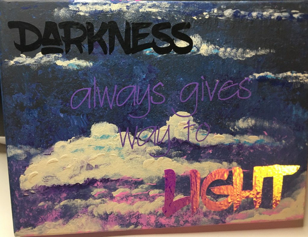
Making a new style out of throw away materials

The one bit of insight you have, when working for someone else, is just how much a business throws out. And the quality of their garbage. And you also gain insight as to what kinds of businesses subsidize other businesses for you marking your product down for their employees.
I personally know of a few companies who have switched to the Lean Operational method of running a business. And even then it still, somehow, manages to amaze me how much gets thrown out.
Maybe it’s the fact that I grew up where we didn’t have as much as other people around us. Maybe it’s the fact that my mom created magic when she made the gifts we were given on less than a shoe string budget. Maybe it’s the fact that I carry on that frugality because our family budget can go farther and do more things when I reallocate and make do with the little I have, so the hard work of my husband can go elsewhere for family provisions.
This craft here is me on a plate, for you. This is me thinking outside of the box. This is me using materials where half of what you see is stuff that most people throw away.
If you are looking for a new infusion to your farm house style or Easter decor, this project is for you!
Materials
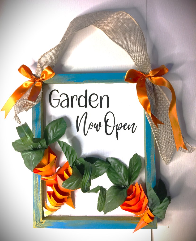
- 8×10 Canvas Frame
- Teal and Metallic Gold Acrylic Paint, with paint brush
- 2 Complimentary Ribbons
- HTV Vinyl (Permanent Vinyl is another option)
- Garden Now Open SVG
- Leaves from Silk Flowers
- Hot Glue Gun with Glue Sticks
- Pliers
- Crafting Knife or Scissors
- Staples (optional)
- Sandpaper (optional)
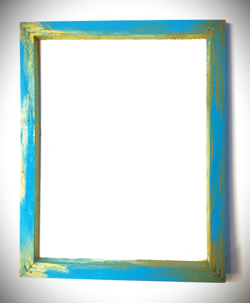
Prepping the Frame
First you want to remove the canvas from our frame so you can paint the frame for your reverse canvas. (If you’re new to Reverse Canvas, hold on for a moment and I will circle back to help you through this process.) Paint the front and sides of your frame with Teal paint. If you keep the paint very thin, you will notice that the paint is dry to the touch in about three minutes. For this example, I went in a circle around the frame twice with the minimum amount of paint (dry brush method, where it look likes and almost feels like you’re brushing on already dry paint) and ended with full coverage of color with no waiting time to apply the Gold paint. It’s really not in my budget to play with Gold Leaf. I would use it for a client. But for the rustic feel I went for, metallic gold paint was enough to add a smidge of class to an otherwise rustic feeling project. And the gold, I used somewhere around a nickel size drop of paint and hit the corners and some edges. Then I set the frame to the side to dry while I added the HTV to the canvas.
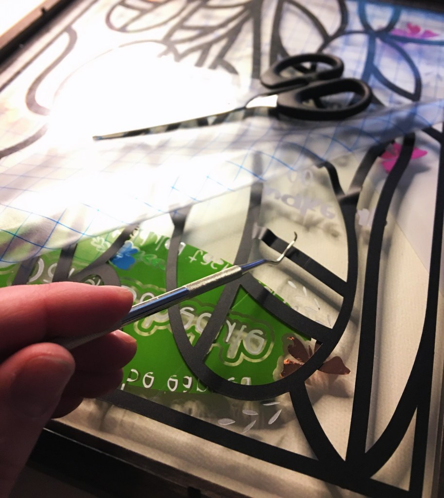
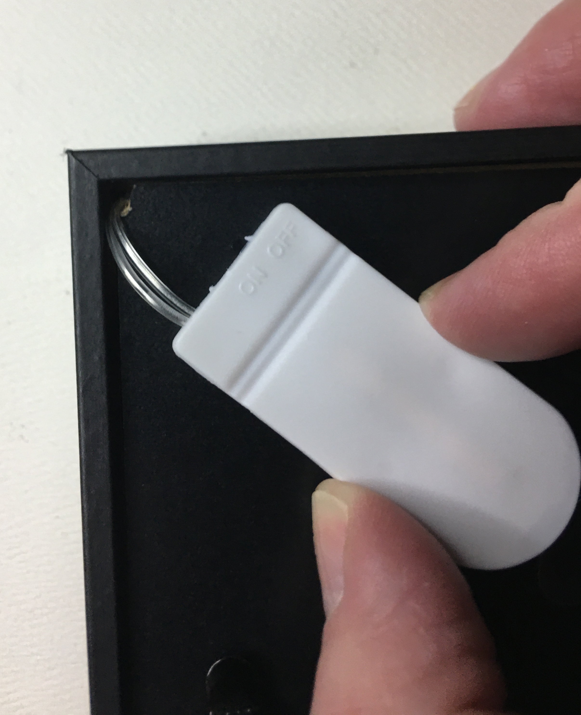
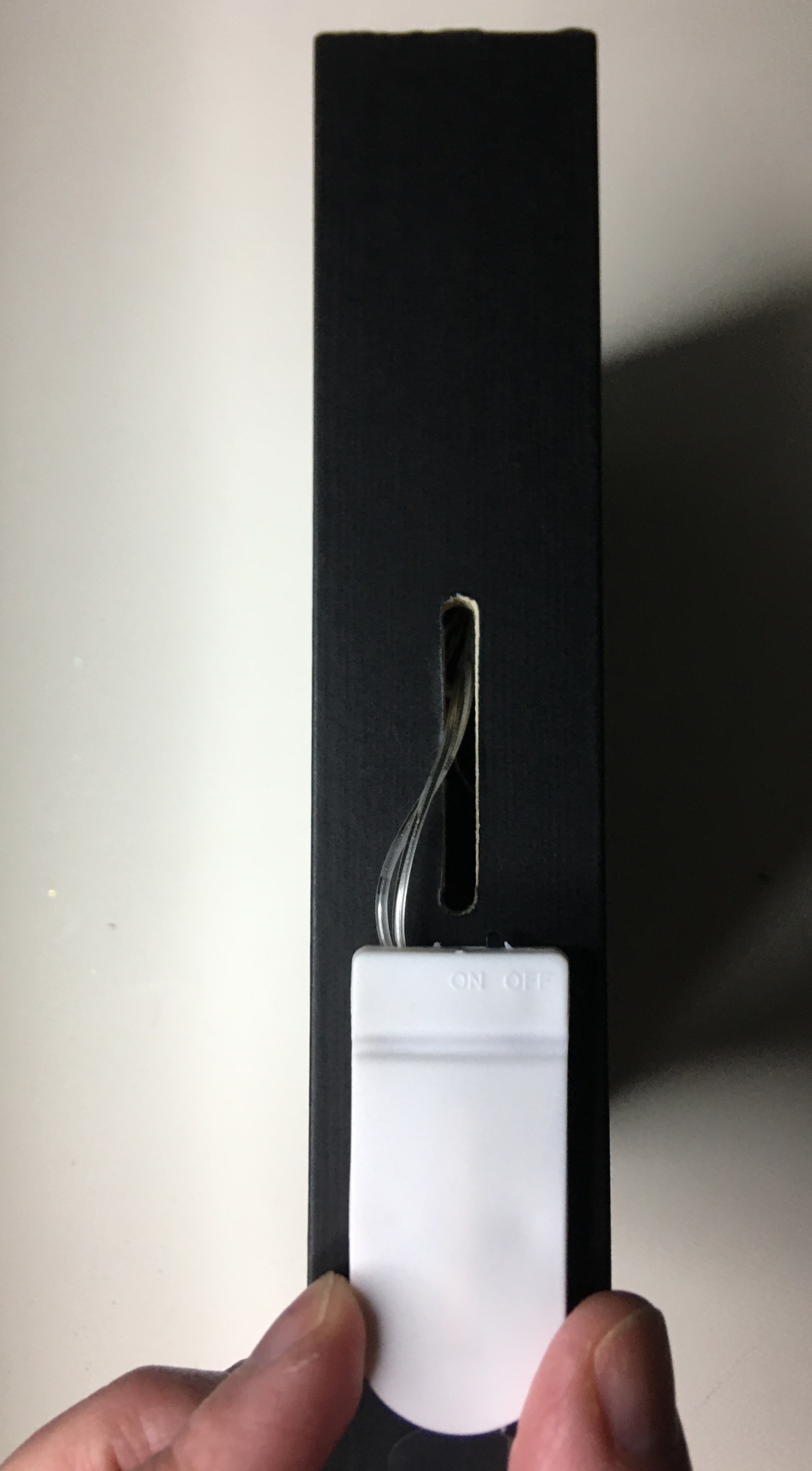
First Time Creating a Reverse Canvas: From the back side of the Canvas remove the staples with a pair of pliers. (There are two different methods of putting the canvas back on the frame, which I’ll cover in steps ahead. I just want to let you know from the beginning, if you remove the staples right from the beginning, it can save you from potential problems in future steps. It’s not mandatory, but definitely one of my highly recommended steps.) If small holes next to the staples happen, don’t be afraid, you will not see them later on. If the staples are stubborn, feel free to cut the canvas next to the staple, with a crafting knife, and release the canvas. Set the canvas to the side and move forward with painting your frame, mentioned above.
TIPS: If you’re keeping with the rustic look, there’s no need to sand your frame. If you want a smooth looking frame, you will definitely want to sand your frame before you paint it. If the frame staples are visually unappealing to you, I highly recommend dry wall spackle. You can find some that is purple when you apply it and turns white when it’s dry. It’s very easy and convenient to use, with next to no guess work. A palate knife or even your finger is all you need to apply the spackle. Once it dries, you’ll quickly run over it with sandpaper a couple times. This will smooth out your edges. And when you paint your frame, no one will know that you used putty to fill in the frame cracks. (This is the same method I use when I want to use a frame that for one reason or another was gouged or dropped.
Applying Vinyl to the Canvas
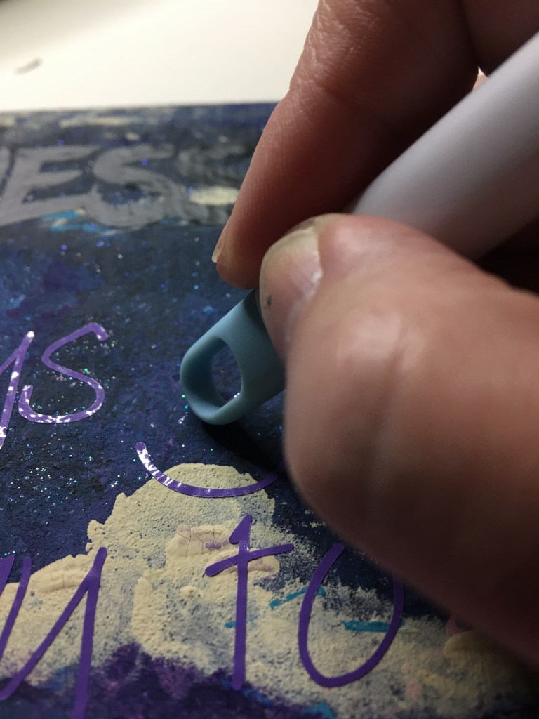
When you go to cut your HTV (High Temperature Vinyl) from your cutting machine, remember to mirror your image. Once you’ve weeded your vinyl, you will place your frame on top of your canvas, so that you can see exactly where you want to press your carrier sheet down on the canvas. (This step is mostly important if you have a few small holes in the canvas that you’re working around. If you’re canvas came off the frame undamaged, than feel free to skip using the fram as a point of reference.) Follow our vinyl’s directions for heat and pressing time. These settings vary. Once you’re vinyl is attached, proceed to reattaching your canvas to your frame.
What if I choose to use Permanent Vinyl? I have successfully used permanent vinyl on canvas. I prefer HTV over 651 (or permanent) because once I have it adhered I do not have to worry for one moment about humidity causing the vinyl to lift. But please do not be shy with using permanent vinyl. You will still want to use an iron to press your Canvas. If there’s any moisture in the fabric, the iron will get that dried out and prepped for your permanent vinyl. Once you place your vinyl, you will want to make sure to have your project on a hard surface that you can press down with a scraper or squeegee. The more attention that you use with burnishing that vinyl down will pay off in the end with a longer life to your craft. Remove your transfer tape and then move forward with attaching the canvas back onto the frame.
Reapply Canvas to the Frame
There are two ways of doing this; hot glue gun or staples.
Method Hot Glue Gun: Apply a liberal amount of hot glue to the back of your frame. Flip it over and position it over your canvas before pressing down and attaching the two together.
The benefit of this method is that it is so quick! Any skill level of crafter can do this application. The important thing to remember is that you have to move quickly so your glue doesn’t cool down on you. AND you will want to try and manage how much glue you use. Too little and the canvas won’t want to stick to your frame. Too much and you will have guaranteed seepage of glue that you will have to clean up. My recommendation is err on the side of a little too much and keep the glue a little off center. It’s better if it seeps out of the outside edge instead of the inside edge. With an inside edge seep, you will need to try and scrape the glue off the canvas or risk having what looks like slug trail on your canvas.
Method Staples: Flip your frame upside down. Position your canvas on top of the frame. Take your staple gun and staple at the top center of your frame. Gently pull your canvas down and place a staple in the center bottom of the frame. Gently pull the canvas to one side and staple in the center of that side. Gently pull on the other side of the canvas and staple in the center of that side. This is called Stretching Canvas. You will then go through the whole rotation again, moving out from center. On a frame this size, you should have about 5 staples across the top and bottom. And about 7 down the sides.
In my opinion I recommend stretching your canvas with the Staple Method. Anytime you add anything to canvas, if it’s not taunt, the weight of your project will warp the appearance of your canvas.
I’m in a crafting group where many of the crafters there swear by the hot glue gun method. In that group I withhold this information because in that setting it’s more important to have these ladies soak up the success of accomplishing a craft that they might not otherwise have attempted.
Here, I want to give you further information because I want you to make an education decision based off of the goal you are after. If you are making this to sell at a craft fair, or you’re decorating for an event that you want professionalism for, I want to set you up for success in these moments. And I know we are not face to face so I can’t use my tone or non-verbal cues to fill you in on this. I am by no means dogging on the hot glue method. In fact, in this example I’m showing you I couldn’t find my staple gun and so I in fact used a hot glue gun. I know the value of stretching canvas and so even with a hot glue gun, I still stretched my canvas. It took much longer than with a staple gun. And if I were using something of more weight than paper carrots, I can assure you that I would not trust hot glue to keep my standard of professionalism to clients. (I know my limitations with hot glue guns, and I’m woman enough to admit that there are many other crafters out there who are geniuses with hot glue. I have skills, but I am not a hot glue gun goddess.)
I want you to feel comfortable with your skill level and what goals are for this project. If what you have available is a hot glue gun, you’re not at all comfortable with stretching canvas, and you’re new to reverse canvas making–PERFECT! Know that you can make a beautiful and professional looking canvas using this method. If you want the challenge and extra security that staples offer, than stretching your canvas is exactly what you’re looking for.
Once your canvas is attached, you will want to trim off the extra canvas. You can either use a crafting knife and cut away on the outer edge of the frame. Or you can use a pair of scissors, angle you blade into the back of the frame, and trim the canvas back.
With clean edges, it’s now time to add those carrots!
Carrots
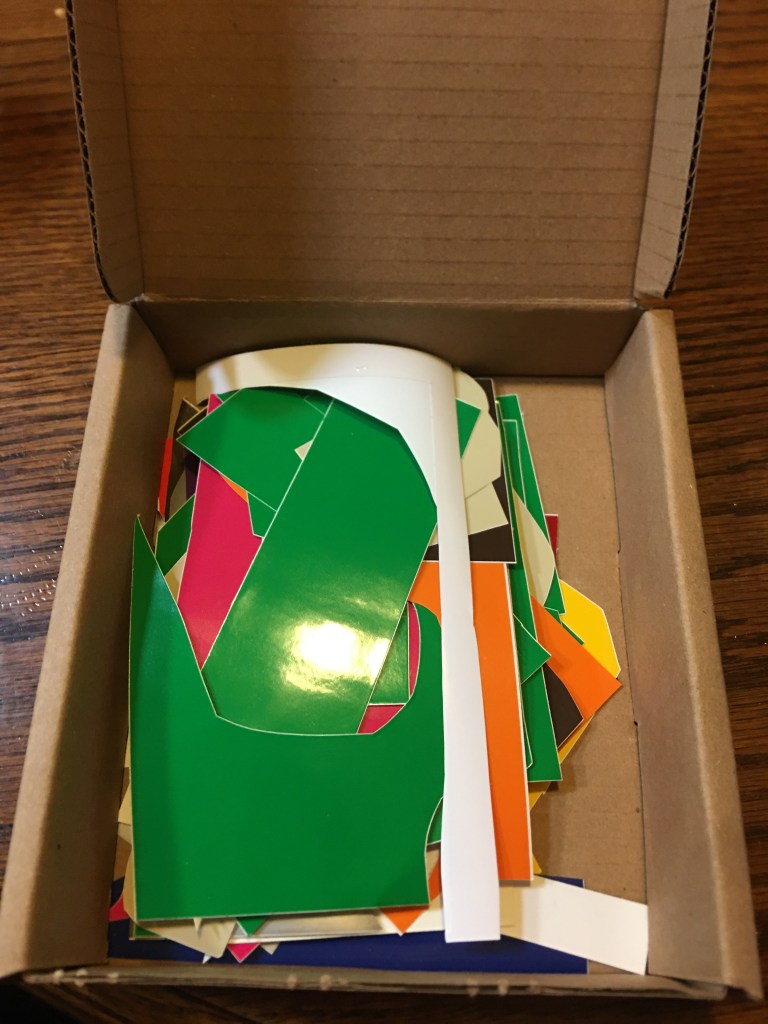
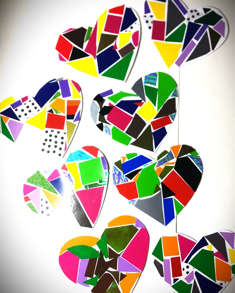
This is the part that I’m most excited about. These carrots are made completely from scraps that most of the times end up in the trash or recycling bins.

Most of these segments are made from triangles and parallelogram scraps about 3″ wide. Some wider, some less. All of these were from scraps from an explosion box I made a few months back. The card stock was 5 different textures and shades of orange. In fact, one of the orange papers was actually faded from being left out in front of a window. The segments you see above were not triangles and so I pre-folded them in triangular forms to make it quicker to shape and hold with a small drop of glue.
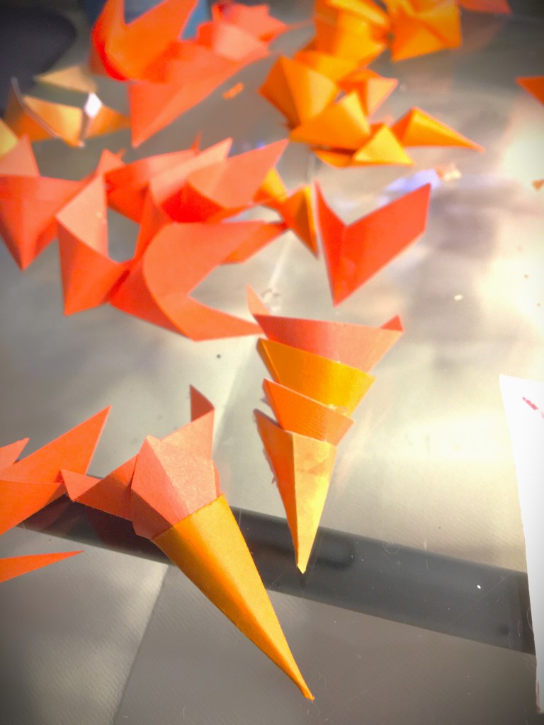
These single cones I then stacked with each other. On a few of the carrots I placed the glue on the back of the cone. Most looked better with the attachment point being at the front of the cone.

I made a few extra carrots than I had space for on the canvas, because I wanted to have some choices of which ones looked better than others. In fact, one carrot had a herringbone look to it. And since it didn’t have the same feel as the others, that one got set aside for a future project.
Once I got the length of carrots that I was happy with (a few were 4″ long and others were as much as 8″), I went into my bin of silk flowers that have seen better days. In fact, they were part of the flowers that I bought from a wedding planner who was selling all of her inventory. I was after her roses, but she gave me her entire flower collection. These leaves were actually from some geraniums and daffodils. The daffodils were actually really beat up and were just collecting dust, because I couldn’t use them for events. And this was the moment that I could actually give these greens a purpose. Other than purchasing silk ferns, these greens were actually quite perfect.
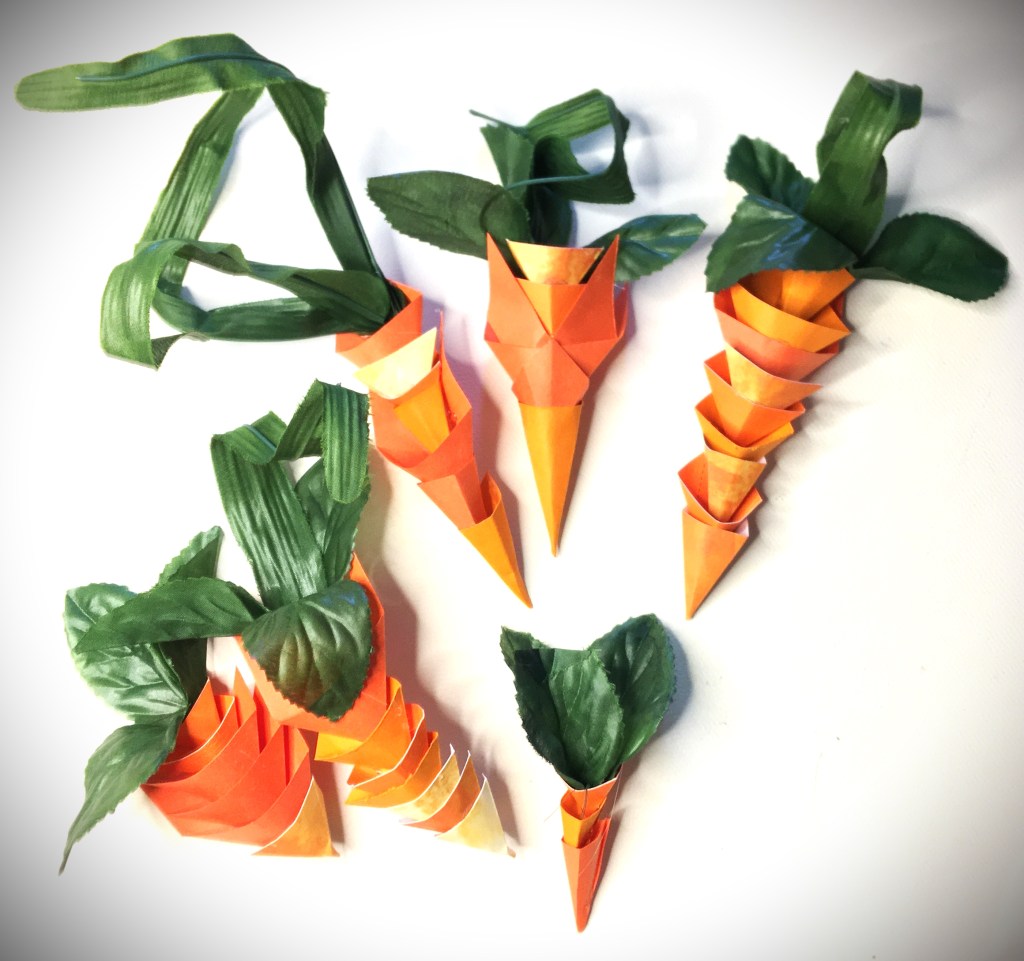
What makes these carrots so special in the crafting world is that it embraces the cubism element from the art world. I’ve seen a lot of carrots made from yarn and cloth, styrofoam and foam. These paper carrots give talking points and structure. And this structure is what was great for placing in the frame, with the ability to break free from the frame (giving a nod to surrealism).
Finishing Touches
Once I found the placement that I liked for these carrot shapes, I glued them down with hot glue gun.
Due to the light weight nature of this project, attaching the ribbon with hot glue is enough. However, if you’re creating for a professional item, you will want to use a stapler to attach you bottom layer of ribbon to the frame. For the top ribbon attachment, E6000 glue would be better than hot glue. But hot glue does do the job for a non-sellable project.
Please comment below and tell me how this spring time project turned out for you. Pictures are even better. I love seeing what other people make!

The SVG used in this post can be found here